We were supposed to create three different types of logo. We had to combine all the things we learned this year and make it a one project. In my logo, I used the aligning tool to keep my letters and shape neat and clear. Overall, my logo was fairly simple, but aligning some shapes and choosing the right color was difficult.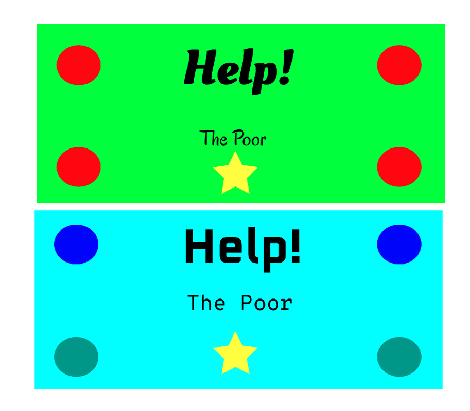 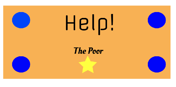 My logo is for a company that helps the poor. The company provides poor people foos, water, shelter, and etc. I decided to choose this logo because to let everyone equal and to include the poor people. The image below was my favorite because I liked the colors and the fonts fit well with each other. 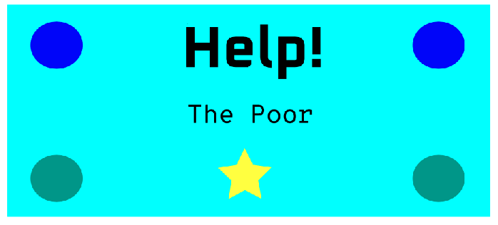
0 Comments
In my 2 assignment for the color theory, I faced many different challenges. First, I had to constantly move the cursor to find good colors that match well with different colors. Also, it took some time for me to search for colors that compliment each other. Some achievements that I made is that the colors worked well with each other and everything was organized. Also, I was able to use different shapes and find different colors. Overall, this was a great experience for me. 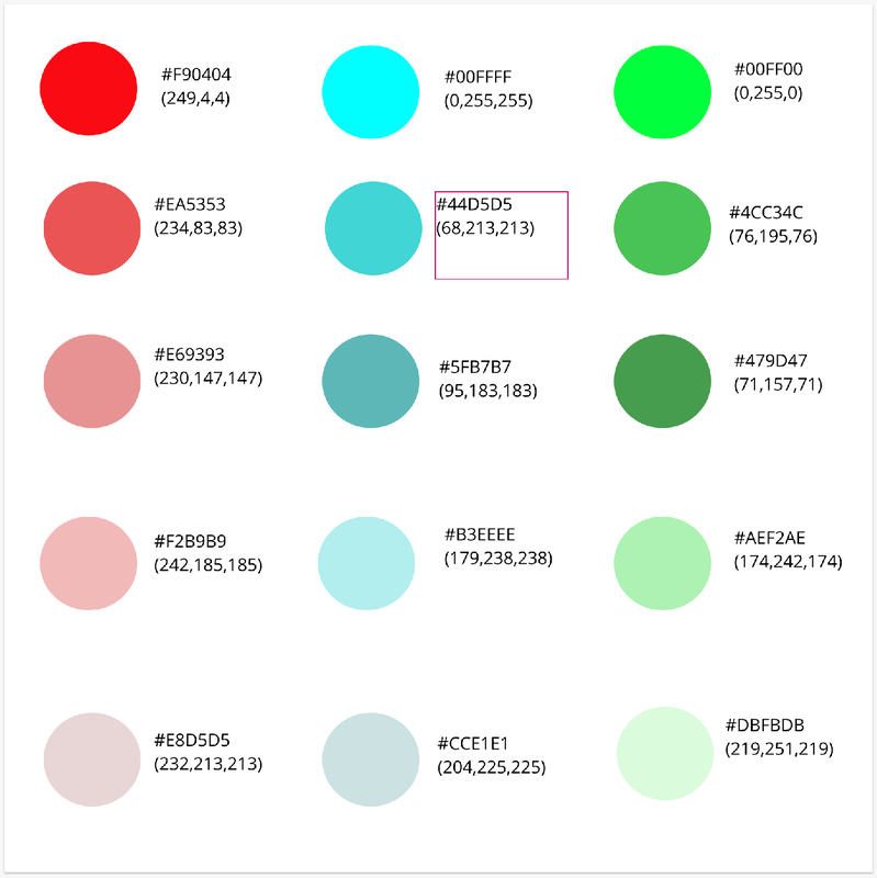 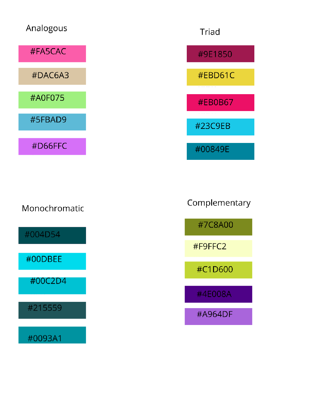 Typography is the act of arranging and changing the word to make it more readable or look better. Typography is important because it helps you marketing if you are selling something. Also, it helps the audience to see and share clearly. In class, we learned about Sans Serif, Serif, Handwritten, Display, and Monospaced. Sans Serif don't have "feets" while Serif does. Handwritten fonts are handwritten or in cursive and display fonts grabs people's attention when displaying something. Lastly, Monospaced has the same space between each letter. Overall, all of these fonts can be useful in different situations.Typeface ComparisonWe had to pick 5 words and compare each of them. 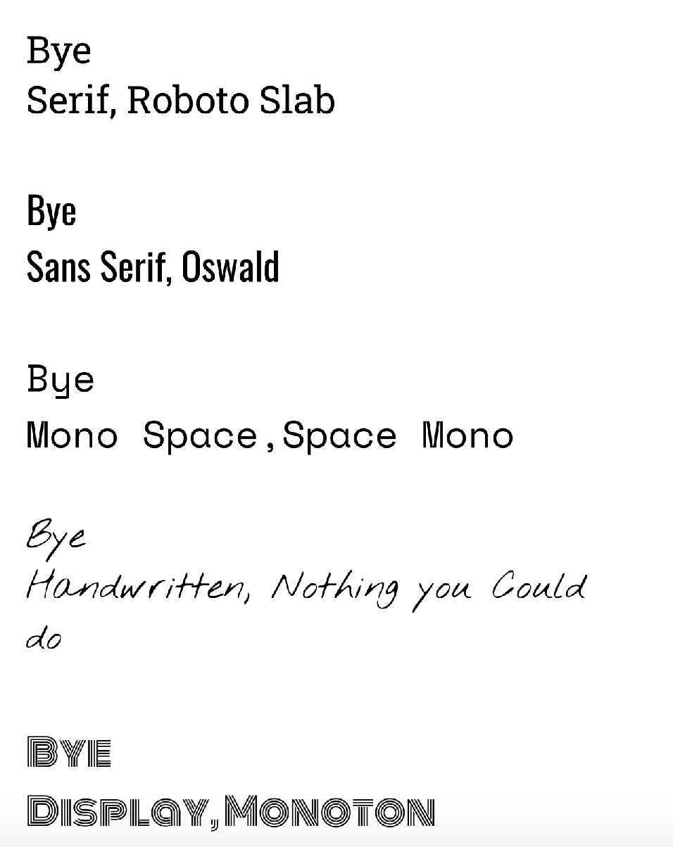 Word PortraitsWe had to find 10 words that matches the fonts and that doesn't match the font. 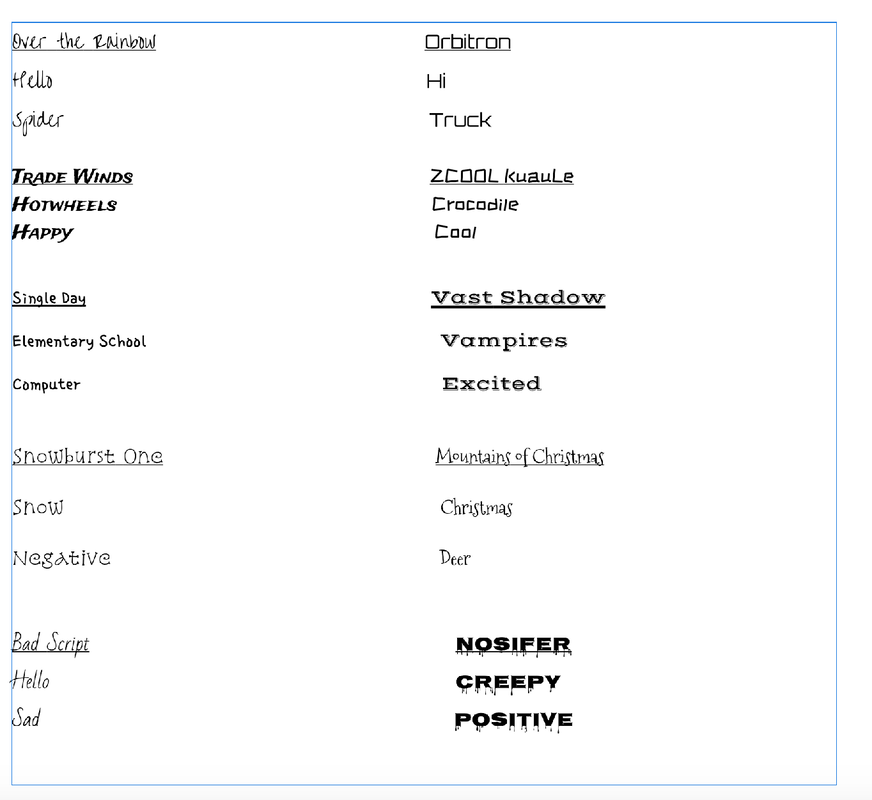 For the pen toll exercise that I did, I was assigned to trace over drawings. I used the pen tool extension in Gravit. This allows me to crop and draw images. For tracing, I traced several super hero logos and even tried to make the spider man logo. For my final image, I took my favorite sport, basketball. and I switched it with an actual basketball in the NBA. This was challenging because of ridges and corners. of the shape. This assignment was helpful for me because now I know how to crop and use the pen tool extension. 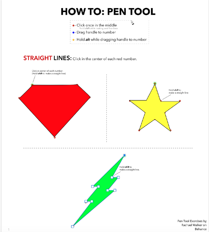 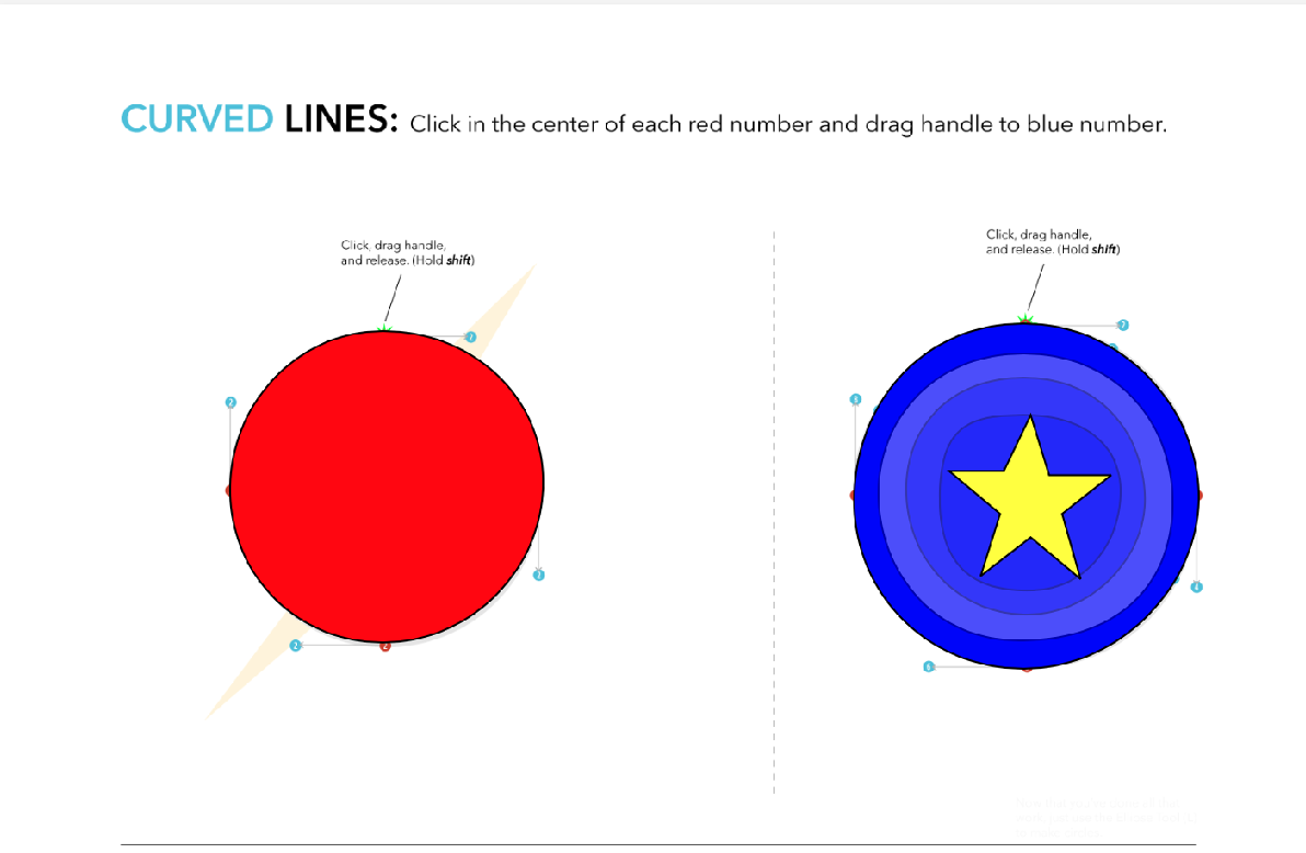 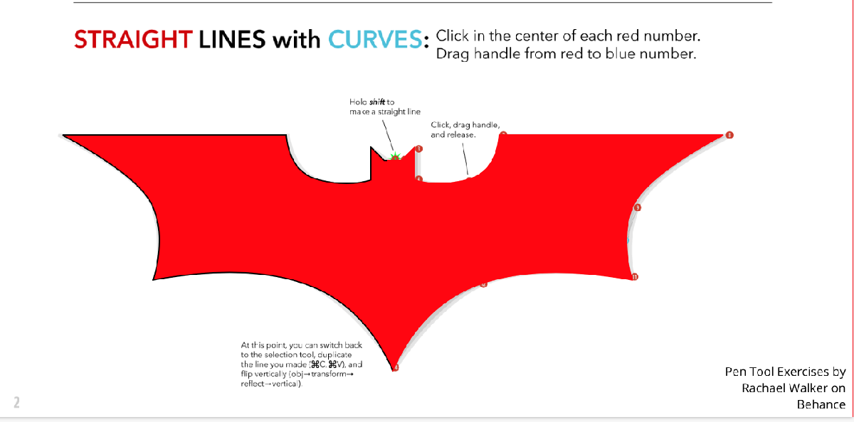 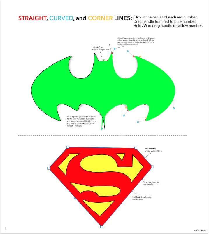 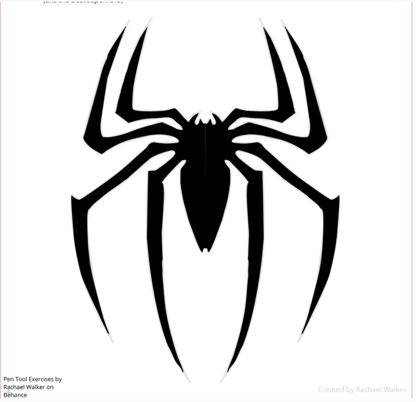 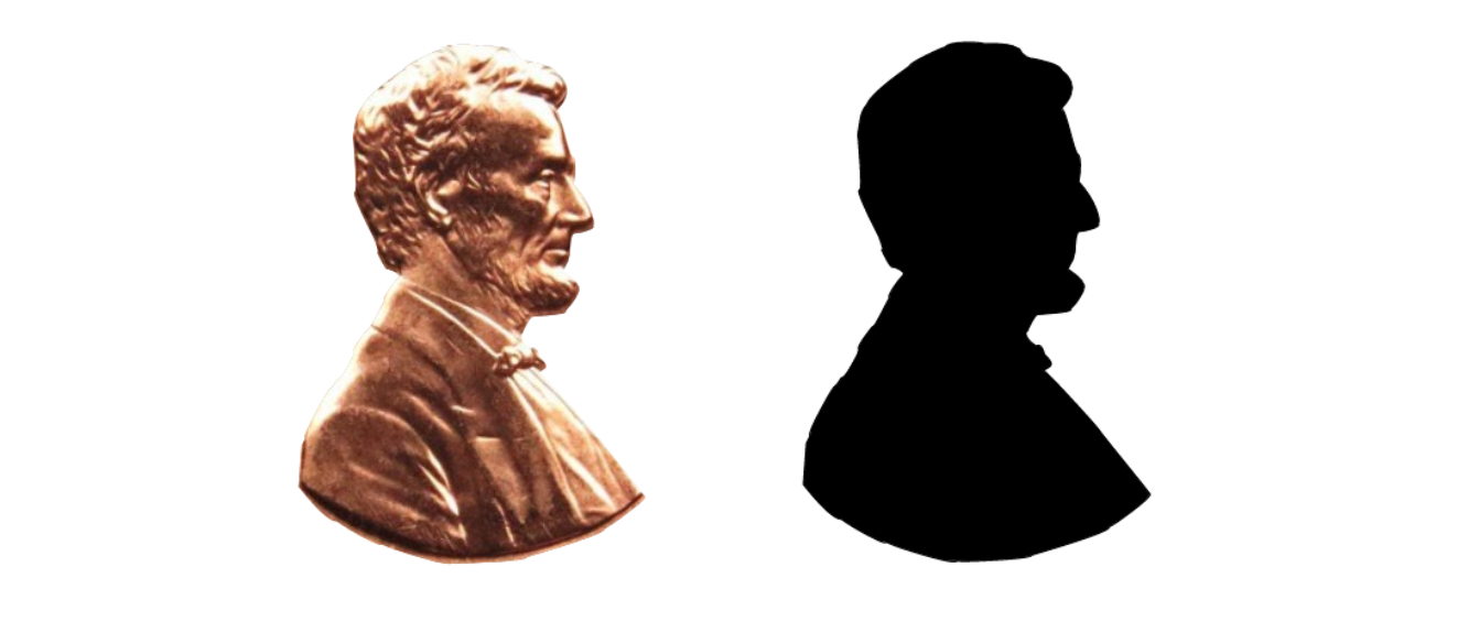 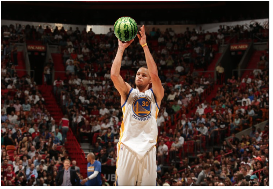 https://www.frutas-hortalizas.com/Fruits/About-Watermelon.html
https://www.wsj.com/articles/stephen-currys-science-of-sweet-shooting-1418766120 The scene I made is a dish with food. These are the foods I sometimes eat in the morning. My mom usually cooks breakfast and it is really good. I enjoy eating them. 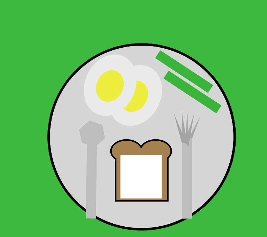 I learned how to modify different shapes. I also learned how to union, intersect, subtract, and the different functions of Gravit. 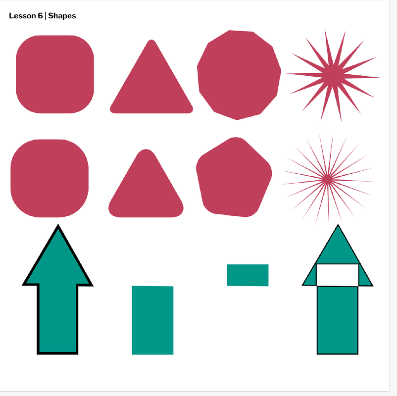 I learned how to group several objects using key board short cuts. I was able to expand my knowledge of alignment and I also learned how to add layers and arrange them. 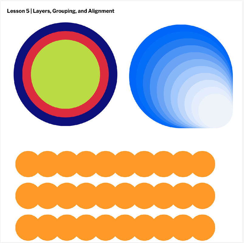 In this project, I learned how to modify elements and borders of shapes. I also learned how to align borders and corners in three different ways. I learned that it is possible for the shape to be transparent. As well as making a dashed border. 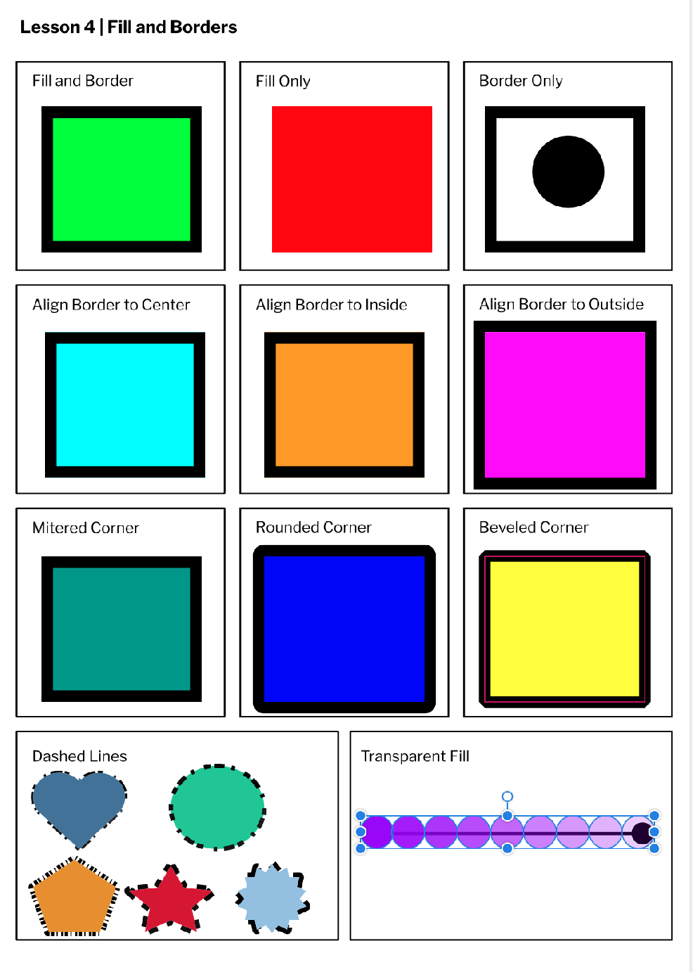 In this assignment, I learned how to make and change different shapes. I also learned how to align the line, change the color, size, and the location of shapes. 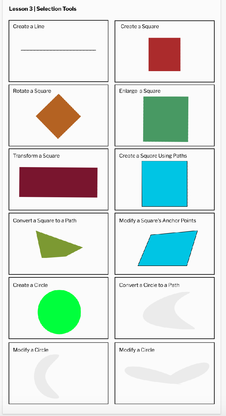 In this project, I learned how to use the basic features on Gravit. Some things I learned is auto save, create text element, change fonts and sizes, and how to align boxes. 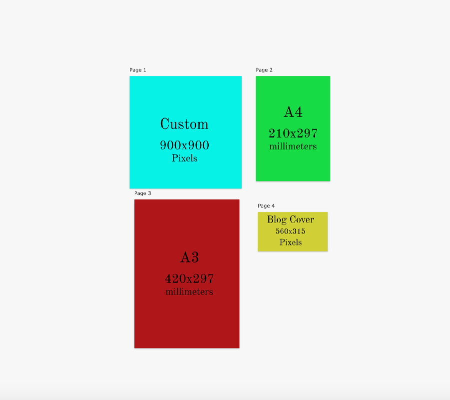 |
